There’s a smart piece at Macworld with some suggestions for making calendar software smarter, including this gem:
I’d love a feature that allowed me to set a maximum meeting load, after which my entire day would become blocked off as busy and all future meeting requests would be declined.
During advising season, when I’m meeting with my 23 advisees in a 3-week period, I already do what he describes, adding dummy appointments for breaks and class prep time. But with a little smarts built in to the calendar software this would be unnecessary.
One point in the article that I have to disagree with is this:
[…] calendars that show you an entire week or month are wasting space—and the closer you get to the end of the week or month, the more space it wastes. Can’t we break free of this metaphor and let time and space be a little more flexible?
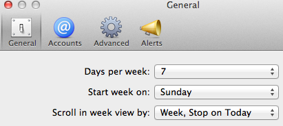 I’ve tried to use the Calendar app in Mountain Lion configured to ‘Scroll in week view by week, stop on today’ and just can’t get used to it. I agree this seems like a better use of space, but I have become so habituated to glancing at my calendar and associating position with day of week, I can’t break out of it. I always see the left-most column as Sunday, and the right-most as Saturday. In addition, I think there’s value in viewing time in actual weeks and months and years, I think that adds rather than detracts.
